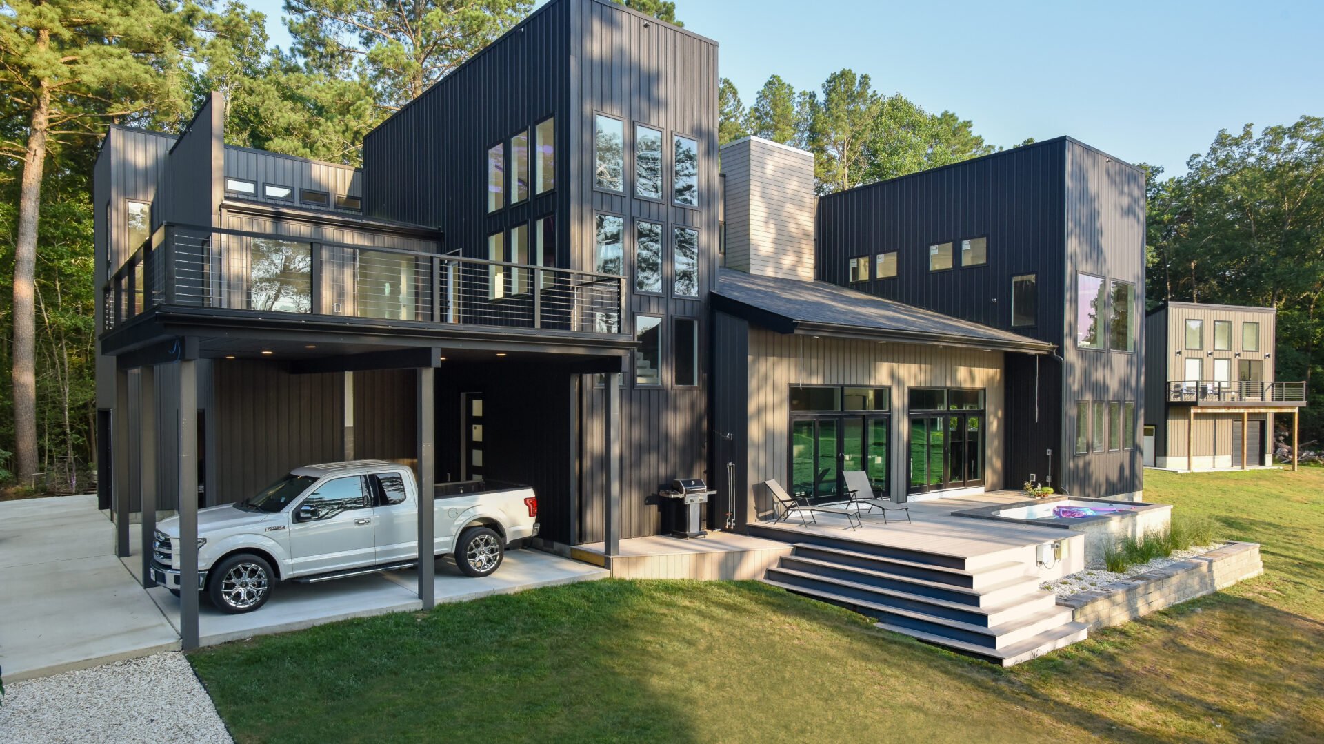
We’ve named this one the Modern Mansion because while putting together the media for this, the official first grader of Archology asked, “Is that a mansion?” I’m not sure it quite qualifies, but it does alliterate with one of the design themes, so we’re sticking with it. The official child’s response to the images was that she loved the design, and frankly, we do too. It’s what can happen when a client has a clear guiding principle, gives us some room to cook, and has the passion to follow through (especially as this was a self-build, and not the kind where they were just getting their own subs, the client actually did most of the physical labor on this home)
So, what were those guiding principals? A husband and wife came to us, with semi-conflicting goals. That’s ok, being a part time marriage counselor is part of the job. The wife wanted a home with a lot of space, a lot of light, and modern elevation, with no visible roofs or slopes with a maximum of clean lines. The husband wanted something easy to construct (again, he was going to do most of the work himself) and with maximum durability and absolutely no membrane roofs. This might have seemed a contradiction, and at first, it was. But we quickly zoomed in on a solution that solved the problem. Parapets. We have not a single flat roof, but we have very rectilinear elevations, especially from the front and mostly from the exposed side. Luckily, the clients were far less concerned with the aesthetics of the back sides as they weren’t very visible to others or even to themselves as the lot was very much oriented to the water on one side and the driveway coming in on another.
From there, the details flowed easily. We emphasized a modern front elevation. We suggested vaulted ceilings and clerestory windows to maximize space, connection, and light deep inside the house. A clerestory window also met both client’s criteria of bringing in light deep into the house while reducing the chance of roof leaks over a skylight system. When it came time to discuss siding, given the size of the home, limited work force, desire for limited maintenance, and monochromatic color scheme, we suggested metal panels which would fulfill the owner’s criteria economically over the long term.
This was one of our favorite designs, and the feedback we got from the owners was that they loved it too. Even better, it’s been a few years since we did the work, and the building has performed as expected, with minimal upkeep and an ability to keep the family safe from the elements.
This home has a mix of high modern imagery with more contemporary detailing to balance the desire for a clean facade with the desire to limit the possibility of roof problems.
Walking up to the front is a very square experience. We hid the sloped roofs behind parapets because one of the clients wanted a very clean, modern elevation, and the other wanted to minimize water intrusion problems.
Looking into the kitchen and dining room, there are a ton of windows to enjoy the views of the pond alongside this lot.
This side is all about the masses. There’s a central raised roof that provides connections throughout the home and light deep inside with a clerestory. On either side are masses containing the primary bedroom and central stair to give each a prominence and a view.
The main living space opens up to a deck to enjoy the view. The ceilings are extra tall allowing for large doors with transoms to maximize the indoor/outdoor nature of the living space.
An image of the rear of the home, you can see more of the roofs from this angle as no one will ever be looking at it. You can also see the generous glazing that allows the primary suite and the dining room to gaze out at the pond.
A view from a drone at the front of the house. When you get up, you can see how we arranged the rooflines to make sure everything drained well, but kept them hidden from the approach to the home and mostly to the main side of the house.
Enjoying these giant doors and windows to bring in generous amounts of light. The fact that the client chose dark walls and floors didn’t adversely affect the feel of the home because of the generously sized rooms, high vaulted ceilings, and large expanses of glass.
Everything flows together. While the bedrooms are where you can go to maintain privacy, the living spaces are all within view or at least earshot of each other when you want to call the family to dinner.
Looking down from the hallway above that connects to all of the bedroom spaces, you really can’t hide in the living spaces, which makes it nice that the bedrooms are able to close themselves off and have generous room for times you want to be alone.
The master suite is almost it’s own wing, with windows looking at the water and up high to let light in deep inside the house. We used this trick in the bedrooms and hallways that could otherwise have been much darker spaces.
You can see thee access to the primary suite in this picture, from the hallway. This room is almost it’s own space, separated from the rest of the house by it’s bathroom and closet spaces. The rest of the house is open and inviting, this room is it’s own place to be alone with your thoughts.
The primary bathroom is large, spacious, and provides a great buffer from the rest of the house. Even with the extensive use of black tile, it doesn’t risk feeling small and cramped.