Kaisy’s Delights – Rehoboth Beach Take Out Restaurant
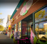
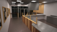
This take out restaurant was our first collaboration with a family creating their brand as they emigrated to this country. They served a unique product and wanted a space branded in a unique way that stands out. As the first location to be put together, we had to work out the items that would become their brand as they expanded. We also had to work within the envelope of the commercial shell they had rented.
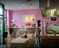
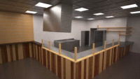
The basic plan layout with a large open kitchen was dictated by two things. The first was a desire to display their product and how it’s made. The second was to limit the space for seating so that we did not have to provide a public restroom. This often leads people to wondering why so much of the floor space appears wasted. However, the kitchen is just a little oversized as it was intended that most of the customers would order and walk out towards the beach.
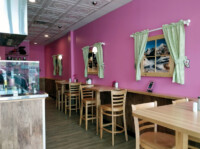
The pink is what happens when you have a client who is unafraid of being bold. It’s part of their branding and really stands out. People generally love it or hate it, but it gets noticed either way. The wood accents are a callback to an Alpine style. Given the main product of this store is a dish created in the Austro-Hungarian Empire, it’s a very suitable choice. The contrast of the modern color with the traditional elements fits nicely with their overall marketing of a traditional dish in a modern format. This design tension would become central to their interior design that we would use later on other restaurants.

