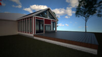
Wheatley Sunroom Renderings
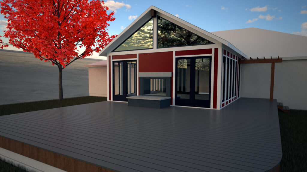
These renderings were for a personal friend of ours. So we decided to have some fun and see what some of our tools could really do. We went through a lot of discussions about selections to try to get the look of the building correct. The bold color choice was ours and would probably have been toned down to a more neutral color. However the raised panel design would probably have stayed.
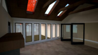
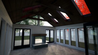
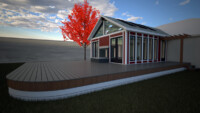
The major design features of this building are the expansive glazed areas with tall windows on the side, a large folding glass door between the house and the room, the skylights, the french doors, the glazed gable, and even the fireplace all allowing natural light in. These renderings were done in a simulated sunrise and the room is still flooded with light. In addition, we included grass and trees on the lot. This gives a better feel for how the room would look in reality.
The large amount of light allowed us to experiment with a dark wood ceiling. This is not something we often attempt. Dark wood ceilings can make a space feel shorter and smaller than it is. However, with the amount of natural light in the room, it allows for a dramatic ceiling. That gives your eye another feature to be drawn to.
Unfortunately, this project was never built as they ended up selling the house. The room was beautifully designed, but it remained a bit outside of the client’s budget and once they had seen the perfect, it became the enemy of the good and they would not settle or remove features to save money. We appreciate that attitude, but it would have been nice to see the finished project. In the end, the extreme fidelity with light that the Maxwell Rendering engine brought to us really allowed this project to shine.

